Monday, 30 April 2012
Friday, 27 April 2012
Wednesday, 25 April 2012
Technical Guide
To give my photos a more professional look I edited the images using Photoshop.
this was the original image for my front cover.
this is the Photoshop image.
Firstly I used the clone stamp tool to even out her skin tone. this is done by holding the alt key and clicking on a patch of skin, and then simply clicking again on the bit of skin you want to cover up.
The clone stamp tool leaves the surface still looking patchy so I smoothed this over with the Spot healing brush tool.
I wanted to make her lips redder, so I used the lasso tool, to roughly trace her lips. then, clicked on Select, and scrolled down to Refine edge. once I refined the edge I clicked on Image and then scrolled down to Adjustments and tweaked the Hue and Saturation.
 Again I used the clone stamp for covering up and minor blemishes and uneven skin tone. I also used it to eliminate the shadow under her eye.
this is the Photoshop image.
Firstly I used the clone stamp tool to even out her skin tone. this is done by holding the alt key and clicking on a patch of skin, and then simply clicking again on the bit of skin you want to cover up.
The clone stamp tool leaves the surface still looking patchy so I smoothed this over with the Spot healing brush tool.
I wanted to make her lips redder, so I used the lasso tool, to roughly trace her lips. then, clicked on Select, and scrolled down to Refine edge. once I refined the edge I clicked on Image and then scrolled down to Adjustments and tweaked the Hue and Saturation.
 Again I used the clone stamp for covering up and minor blemishes and uneven skin tone. I also used it to eliminate the shadow under her eye.
again i used the Spot healing brush tool to smooth over the shin that had been made patchy with the clone stamp. I also used the spot healing brush tool to smooth over her lips.
 |
| Tool Bar in Photoshop |
Tuesday, 24 April 2012
Rough cut feedback
For my rough cut I got feedback from both my peers and my teachers.
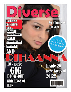 For my front cover I was told the red, white and black colour scheme was good and the bar code was a common convention as well as the ad for 'essential songs for the summer'. I was told there was too many of fonts, the list of artists were difficult to read and they didn't like the text in white boxes. also 'Rihanna' was spelt wrong. also the text at the bottom 'inside 20...'was advised to be in bold. the overall layout had to look more professional. personally I thought the title 'Diverse' had to be bolder. the photo was too blurry so I had to re-take them for my final cut.
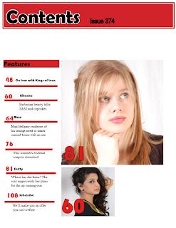 my contents was the strongest out of my three magazine pages. positive feedback included, continuing following conventions with the colour scheme. good photos and on its way in looking professional. the big lettering on the photos made it clear where to find the articles in the magazine and followed conventions similar to my style model 'Q' . negative feedback included; too much dead space, which i plan to fill with more text and more photos. from personal refection i thought the font for the title didn't look professional so i plan to change and make it more simple but bolder.
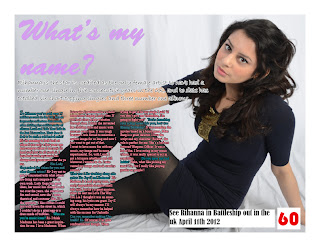 for my double page spread for positive feedback i was told the picture was good and the article was good so far and the quote from one of the artists songs 'whats my name' was a good way of following conventions, however there were too many different colours in the fonts, so i plan to follow my colour scheme and go for black and red font for my final cut. also the caption at the bottom needed to be smaller to follow conventions.
 For my front cover I was told the red, white and black colour scheme was good and the bar code was a common convention as well as the ad for 'essential songs for the summer'. I was told there was too many of fonts, the list of artists were difficult to read and they didn't like the text in white boxes. also 'Rihanna' was spelt wrong. also the text at the bottom 'inside 20...'was advised to be in bold. the overall layout had to look more professional. personally I thought the title 'Diverse' had to be bolder. the photo was too blurry so I had to re-take them for my final cut.
 my contents was the strongest out of my three magazine pages. positive feedback included, continuing following conventions with the colour scheme. good photos and on its way in looking professional. the big lettering on the photos made it clear where to find the articles in the magazine and followed conventions similar to my style model 'Q' . negative feedback included; too much dead space, which i plan to fill with more text and more photos. from personal refection i thought the font for the title didn't look professional so i plan to change and make it more simple but bolder.
 for my double page spread for positive feedback i was told the picture was good and the article was good so far and the quote from one of the artists songs 'whats my name' was a good way of following conventions, however there were too many different colours in the fonts, so i plan to follow my colour scheme and go for black and red font for my final cut. also the caption at the bottom needed to be smaller to follow conventions.
Friday, 20 April 2012
Subscribe to:
Comments (Atom)


